Diving Deeper Into BLAST - II
Creating a modern overview graphic with D3
This is a follow up of the
previous post
where I was trying to parse the BLAST+ XML output to create an efficient data
layer in SequenceServer. A critical and often demanded feature for the
application was the ability to have a graphical overview of all the obtained
hits. NCBI’s BLAST portal, for instance, includes a graphical overview of
your results that summarizes how many hits you got and how do they score.
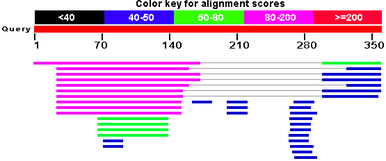 Graphical summary of BLAST results as displayed on NCBI portal.
However, we had nothing for SequenceServer.
Graphical summary of BLAST results as displayed on NCBI portal.
However, we had nothing for SequenceServer.
The feature request had been sitting on project’s urgent list for quite a long time and couldn’t be delayed any longer. So, after having a discussion with project maintainer Anurag, I assigned this task to myself.
Approaches
There were a couple of options for solving this problem. Initially, we
considered using Scribl, an HTML5
canvas based library written specifically for drawing genomic regions,
alignments, assembly data and so on. However, the features and
flexibility that we were looking for weren’t available or not easy to
integrate with our backend.

The second obvious choice was the use of d3.js Javascript library, a powerful data-driven visualization generator. It’s fairly low level and allows a large degree of custom control and manipulation over components, thereby allowing users to create rich, high quality graphics rendered in SVG. The library can be easily powered by the data obtained directly from the backend layer. However, a more elegant choice was to remove this dependency on the backend and disperse all the necessary information inside the page itself using the HTML5 data attributes. These data-attributes would then be highly useful, not only for obtaining data but also for applying custom styling and dynamic behavior using JS. For example, you could just do
// This iterates over all elements with the mentioned data-attrib
// See public/js/jquery.graphit.js

$("[data-graphit='overview']").each(function(i) {
    // Do stuff here
});
Implementation
After the basic idea was conceived, I started playing around a little with d3 and found it quite interesting. Anurag then showed me the BLAST interface of naked-mole-rat.org, a naked mole-rat genome resource. They had implemented a graphical overview feature similar to that used by NCBI except the fact that it was written using d3.
Since, I was relatively new to programming in Javascript, their
implementation really helped me to think of my approach and come up with the
implementation of mine. The initial code I wrote went under a lot of
changes with feedback from Anurag. Although we initially started with an
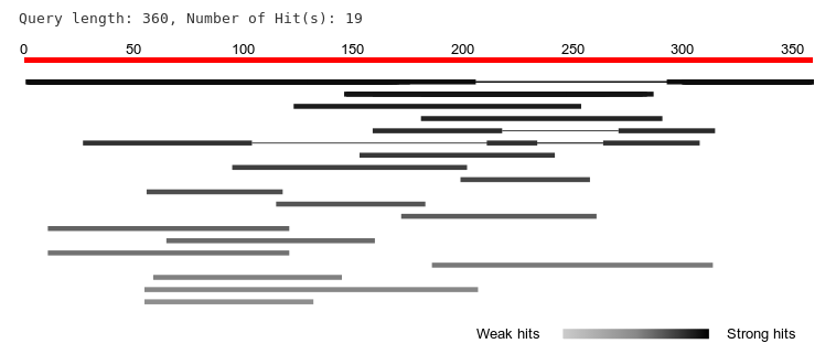
inspiration from NCBI’s graphical overview (shown beside) we improved
many things over theirs e.g., the hits in our graphical overview were
sorted by e-value, a gradient color scheme to display the strength and
weakness of hits etc. We also saved these values within the data-attribs of
each query result (example below) so that we can quickly render the vector
graphics image.
<% hit.hsps.each do |hsp| %>
  <div
      class="hsps" id="<%="Query_#{query.number}_hit_#{hit.number}_#{hsp.number}"%>"
      data-hsp-evalue="<%= hsp.evalue %>" data-hsp-start="<%= hsp.qstart %>"
      data-hsp-end="<%= hsp.qend %>" data-hsp-frame="<%= hsp.hframe %>">
      <table class="table-hsp">
    ..
  </div>
The code was then bundled as a jQuery plugin (“graphIt”) and served minified with the custom webserver.
One of the technical challenges I want to specifically highlight is the one where I had to figure out how to connect each high-scoring segment pair (HSP) with a thin line as there can be multiple HSPs per hit.
In the meantime, we were upgrading to Bootstrap 3 which broke and re-broke my implementation. Each time, when I’ll sit to rewrite the it again, I would come up with a new and better understanding of my code. All this however, happened only after a lot of experimentation which I didn’t talk about much in the post due to lack of time. Nevertheless, there were also a bunch of critical bug fixes and improvements in the backend code which can be followed on GitHub.
In the end, I feel that the upcoming version is much more interactive, elegant and easy to use than the previous ones. I am excited to see it being released for wider adoption. Here is a quick snapshot of the graphical overview for an example BLAST hit.
Epilogue
The current source code of the plugin can be found on Github. Feel free to clone and run locally on your machine. If not, an online version has also been deployed at antgenomes.org/sequenceserver for convenient testing. However, I would like to point out that there will be a lot of planned and unplanned changes happening frequently. So, if you plan to use SequenceServer for production, please use this version until we roll out refined one (very soon).
I wanted to talk more about d3 and my plans to complete a couple of data analysis projects with its help. However, let’s save it for some time later.