Quick Data Plotting in R - I
Useful tips for exploratory data analysis
Python is my all time favorite programming language. I use it all the time. It is simple, readable and easy to get started, something which I picked up four years ago when I went through the first offering of Interactive Programming with Python course on Coursera. Python’s simplicity and appeal has continued to grow over time, supported by a wide community and a rich environment of packages.
Today, however, I am not going to talk about Python. This post shares some of my experiences with R programming language and how it helped me postpone my struggle with visualizations in Python (a short back-story at the end).
Plotting figures is real quick. An example below using the famous Titanic dataset from Kaggle competition.
data <- read.table(‘data.txt’, header=TRUE) # TSV file
names(d) # fetch columns
[1]  "PassengerId" "Survived"   "Pclass"    "Name"        "Sex"
[6]  "Age"         "SibSp"      "Parch"     "Ticket"      "Fare"
[11] "Cabin"       "Embarked"
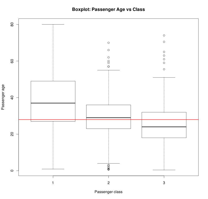
Looking at the columns, it would be interesting to explore the age distribution of the people, along with their survivor, class and sex distribution. Let’s take a look.
boxplot(Age ~ as.factor(Pclass), data=data)
title(xlab='Class', ylab='Age', main='Passenger age vs Class')
abline(h=median(data_Age, na.rm = TRUE), col='red')
Boxplot is a good way to visualize the age distribution across passenger classes.
The histogram below is generated in a single line.

While it may take a bit of time to find out which functions to use (most of the times they have intuitive names), it becomes super easy to generate complex figures by simply composing simple ones.
Also, when handling a large amount of data, plotting with a few tweaked parameters can save quite a bit of processing time. A few of these suggestions and helpful functions are compiled below with relevant examples.
Functions
ifelse()
col <- ifelse(dataSurvived == 1, 'red', 'gray'))
boxplot()
boxplot(Age ~ as.factor(Pclass), data=data)
split()- split dataframe, useful withboxplot
df <- split(data-Age, f='Pclass')
hsv()- generate colors
cols <- hsv((2/3)*as.integer(data-Pclass)/25, 1, 7/8)
points()- draw points on a graph
points(data$Age, col=ifelse(dataSibSp > 0, 'green', NA))
abline()- draw a line on the graph given byy=a+bx
abline(h=median(dataAge), na.rm=TRUE)
par(),layout()- set graph properties, split the graph
layout(c(2,1)) # split the graph in 2 rows
title(), text(), legend()- set graph title, axes labels, legends etcqqplot()- a quantile-quantile plot
Tricks
- Use
pch='.'inplotcommands to use dots in place of big circles. This saves a lot of time especially if there are many points. In case points are too small to see, usecex=2or higher to increase the point size. Usepar(pch='.')to set the behavior for all plots.
plots(dataAge, pch='.', cex=2)
- Use
data.tablelibrary to load very large tables quickly. This could be upto 10x faster than defaultread.tablefunction of R. Read more here.
Epilogue
This post is an outgrowth of my struggle with generating exploratory
visualizations in Python. While using pandas, scipy and numpy combination
is a natural and super effective combination, visualization with matplotlib
or its alternatives like seaborn is equally confusing. The documentation is
too verbose and often there are many ways to do the same thing. While R is not
without its own flaws, I was awestruck with the simplicity and ease of use in
getting started with it (at least for the purpose I was interested in). All
thanks to senior researcher Max.
For a bit more perspective, I was analyzing several gigabytes of derivative
data obtained from whole-genomes sequences of thousands of humans. Using the
scipy stack above, combined with the power of multiprocessing module,
I could spawn 16 processes on the multi-core cluster and reduced the
processing time from 35 min to 2 min. A big win!
However, I do hope to eventually return to Python stack and figure out things with a cool head. Who knows if that’s going to be my next blog post.