Quick Data Plotting in R - II
(more) Useful tips for exploratory data analysis
In the first part of the posts on R, I outlined a couple of useful strategies for quick exploratory data analysis and visualization using R programming language. In this post, I will share a few more examples (in a case-study like manner) along with relevant plots for better demonstration.
Getting rid of artificial patterns
Plotting a graph where one or more attributes have identical values results in a graph which looks stratified. Closely spaced points with similar values tend to fall along a line and create artificial patterns. Consider for example, the plot shown below where Y-axis has many identical values.
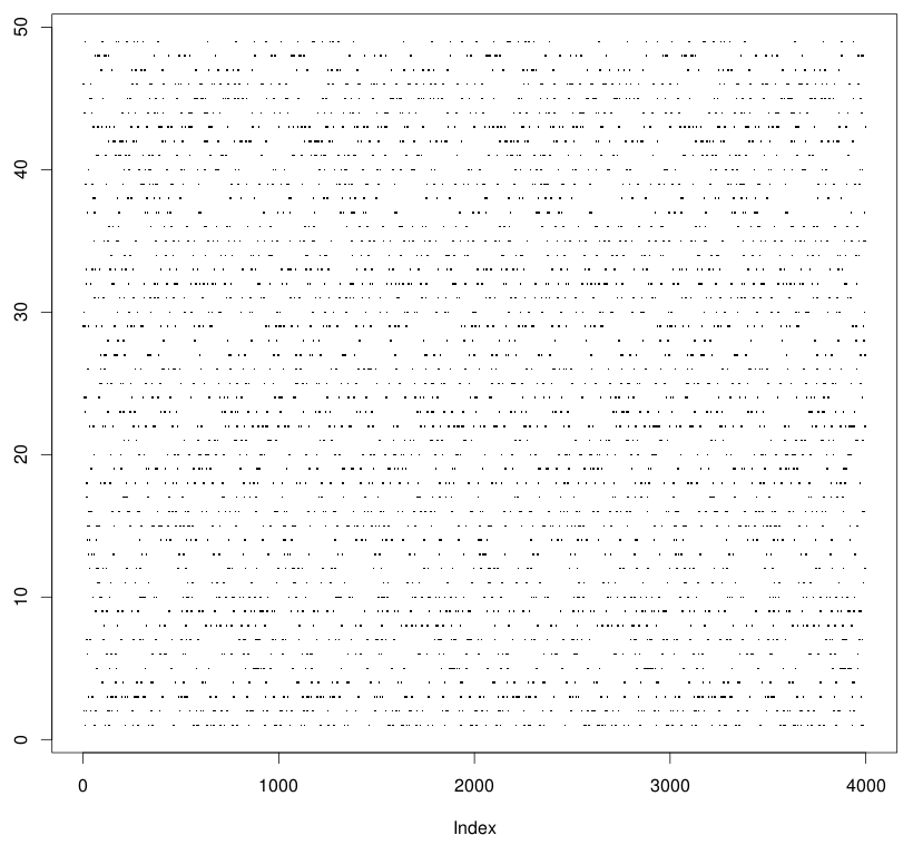
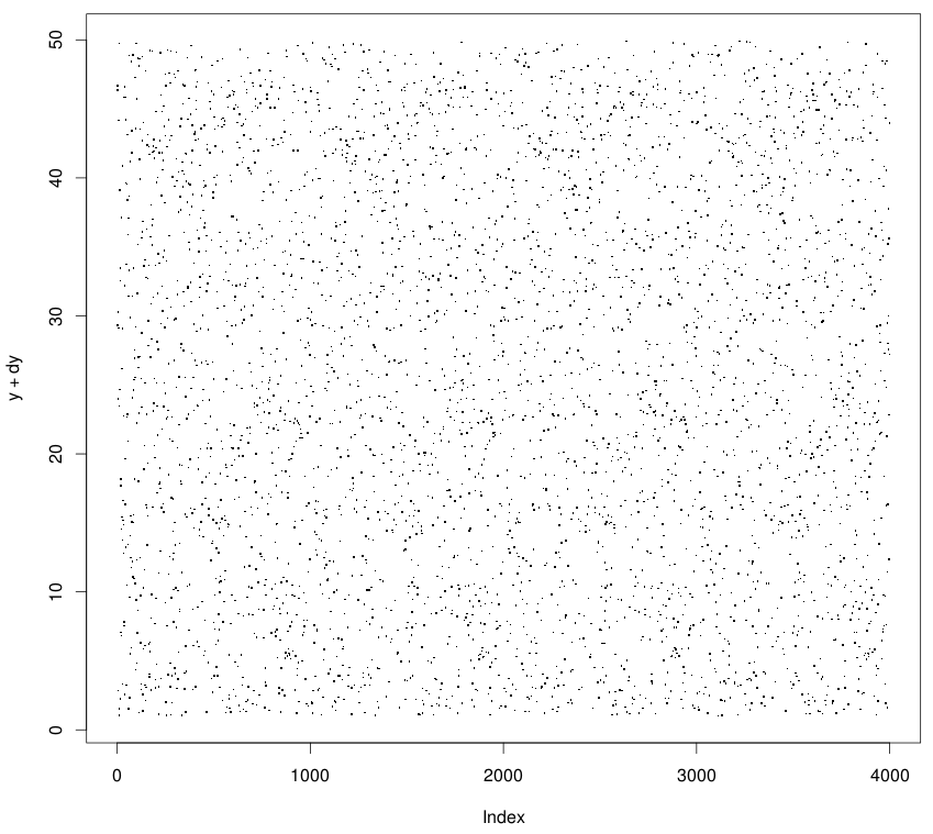
This artifact looks bad and hides the appearance of the data. It is difficult to figure out which regions are denser or sparser than the others. To get rid of it, we add a small random noise independently to the axes which have many identical values and contribute to the artifact. It will cause the values to shift sufficiently enough to appear dispersed without influencing your analyses (since there perturbations are random).
> dy <- runif(length(y))
> plot(x, y+dy)

# in case plotting two independent variables
> dx <- runif(length(x))
> plot(x+dx, y+dy)
The result:
Transparency helps
If we have a large number of data points, our scatter plot can easily become
a blob despite using pch='.'. A good idea in those cases is to color the
points with a level of transparency. This allows the regions of the plot with
dense cluster of points to show up as dark regions when compared to less dense
regions. It also makes it easy to spot and estimate outliers.
> plot(x+dx, y+dy, col=gray(0, .5))
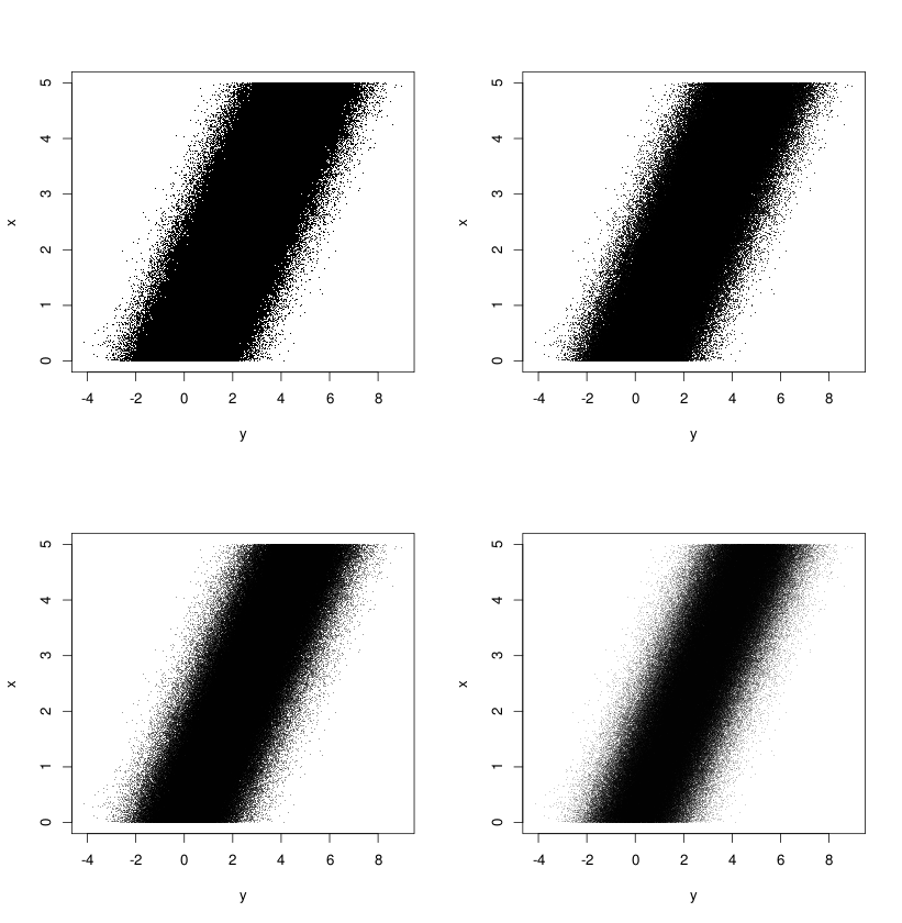
One can further enrich these visuals by drawing the outlier boundaries MAD-Median rule) and coloring the points that lie outside the range.
That’s all for now. Will add more later.